Skip to content

Best video game songs of 2015

Every year I usually have a reasonably strong preference for my favorite soundtrack from a video game that came out that year, but that wasn’t really the case for 2015. So instead, here’s a list of the five songs I’ve probably listened to the most from games released in 2015.

Continue reading ›

Obtuseness: “The Legend of Legacy” and “L-ZONE”

I played through the demo of The Legend of Legacy for the 3DS. It was fun, but I probably won’t pick up the game.

The thing I’ve been thinking about the most is how obtuse the game is. I don’t mean its systems, although those are also opaque: skill awakening is never explained, elemental effects are never explained, status effects are never explained, etc. Some of that may be due to the demo trying to limit information overload, but then obtuse mechanics are a hallmark of the SaGa series that inspired the game, so maybe not!

In any case, what I’m really talking about is how I had absolutely no idea what the heck I was doing. The Legend of Legacy intentionally has no story, and the only motivation for the characters is a directive to explore. The dungeons are just mazes without a particularly logical flow through them, featuring bosses randomly strewn about and secret exits that don’t show up on the map until you physically inspect them, even when your map is otherwise “completed.” There are mechanisms and landscape features that may or may not have any effect on anything when you interact with them, and there are singing statues whose cryptic verses may or may not mean anything.

The net effect was that I was never sure where I was going, whether I’d been everywhere, or whether I was doing anything of consequence. Continue reading ›

Extracting audio from CAF files without re-encoding

Yesterday, I found myself in possession of some Core Audio Format (CAF) files. CAF is just a container format; it can hold audio data encoded with different formats, such as AIFF or AAC. In this case, the files were holding music encoded with AAC.

QuickTime Player can play CAF files without any trouble, but I wanted to add the music to my iTunes library, and iTunes 11 can’t play them natively. I needed a way to convert them into a format iTunes can handle, like vanilla AAC in an MPEG-4 Audio container (.m4a). Since AAC is a lossy compression, I wanted to extract the audio from the CAF files without re-encoding them and losing some quality.

It turns out that this is really easy with the OS X command line tool afconvert. One would usually use this to create CAF files, but it can unpack them as well with an argument of -d 0:

{ -d | --data } data_format[@sample_rate][/format_flags][#frames_per_packet]
    …
    A format of "0" specifies the same format as the source file,
        with packets copied exactly.

So all you have to do is specify the file format corresponding to the audio data in the CAF file with -f and drop a -d 0 in there, and it’ll just work. For my AAC example, that looks like this:

$ afconvert -v -f m4af -d 0 blah.caf
…
Output file: blah.m4a, 7938113 frames

And now you’ve got an M4A file with identical audio data to the original CAF file. You can verify this by converting both files to WAVE or another lossless format and comparing them:

$ afconvert -f WAVE -d LEI16 -o blah-caf.wav blah.caf
$ afconvert -f WAVE -d LEI16 -o blah-m4a.wav blah.m4a
$ diff -s blah-caf.wav blah-m4a.wav
Files blah-caf.wav and blah-m4a.wav are identical

Piece of cake.

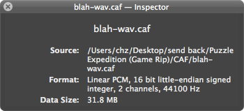
The only potentially tricky part is figuring out what kind of audio data is stored in the CAF file, but you can find this out by opening up the file in QuickTime Player and checking the inspector (⌘I):

screenshot of the inspector for blah.caf, showing Format: AAC, 2 channels, 44100 Hz

… but interpreting the “Format” message could be an issue:

screenshot of the inspector for blah-wav.caf, showing Format: Linear PCM, 16 bit little-endian signed integer, 2 channels, 44100 Hz

(This is WAVE.)

Fucking Tumblr

Tumblr recently changed its posting interface again. Here’s what it looks like now:

screenshot of the new Tumblr posting interface

The new interface was inspired by the “super-constrained environment” of mobile apps, and with it they tried to compact Tumblr’s “years of features,” as one might “[move] a suburban house’s worth of furniture into a tiny New York apartment.” What does that mean? Pop-up menus everywhere!

The gear in the upper-right corner is a pop-up menu. Click it to access some of the more rarely-used post options.

contents of the gear pop-up menu: custom post URL, content source, post date, and an option to let people photo reply

The arrow notch attached to the right of the “Create post” button is another pop-up menu. Click it to access the visibility and queueing options.

contents of the post pop-up menu: publish now, add to queue, publish on..., save as draft, private, and preview on blog

Finally, we have the Twitter pop-up menu. Tumblr lets you send a tweet when you make a post, in case people want to follow your blog that way. Click it to edit the message that will be tweeted.

contents of the Twitter pop-up menu: a text field and a submit button

Except I lied in that description. This last one is not, in fact, a pop-up menu. It is a graphical checkbox that, after a short delay, pops up the text field when you hover the mouse over it, but only when it’s enabled.

There are two parts to that description, because the button has two different behaviors. First: graphical checkbox. When you click it, it toggles between blue and gray. Blue means that your post will be tweeted, and gray means it will not. This is not explained anywhere.

the two Twitter birds: blue and gray

Second: when you hover your mouse over the button and it’s enabled (blue), the text field pops up after a short delay. If the button is disabled (gray), the text field does not pop up. This is also not explained anywhere.

The real fun comes in that the first behavior can trigger the second. Clicking the button also has the effect of showing the text field if you’re enabling tweets; if you enable the button, you’re now hovering the mouse over the enabled button, so the field pops up. Likewise, clicking the button will hide the text field if you’re disabling tweets.

This last, combined behavior, where clicking the button can show and hide the text field, makes it really easy to assume that the button is a pop-up menu. Especially when you consider that there’s no explanation anywhere of the complex way this thing really works, and that there are real pop-up menus in the interface too. Did you enter a custom message and then click the button to dismiss the text field, thereby disabling tweets? Have fun trying to figure out why your post won’t be tweeted! I did, for four days!

This fucking button is one of the most actively hostile UI controls I’ve come across, and I can’t wait until Colin and I move Nullary Sources off Tumblr.

“The Deep Shell Well”

I wrote almost all of this piece in late 2010, right after I finished playing Super Mario Galaxy 2. I never quite finished it, though, and soon it found its way into a folder, which eventually was put into another folder, which thereafter was dropped into some other folder inside a folder. This is not a successful writing strategy!

David Smith linked two days ago a great video by Shaun Inman about the behavior of the camera in Super Mario World. The video got me thinking about how there’s traditionally been a ton of care put into Mario games, which in turn reminded me of this post. So I’m dusting it off.

It’s been two years since I played Super Mario Galaxy 2, so a lot of the details of the game are now pretty hazy. However, I can still run through almost the entirety of the Slimy Spring Galaxy in my head.

And, since I wrote what’s below, I’ve replayed Super Mario 64.

Spoiler alert: this post contains details of level design in Super Mario Galaxy 2, focused mostly on a thoroughly illustrated description of the Slimy Spring Galaxy in world 6. If you haven’t played the game and don’t want the level spoiled, then don’t read this post! Otherwise, feel free to proceed. I recommend it; I feel this is something special worth talking about. Continue reading ›

SpaceX’s Dragon launch

This SpaceX launch got me thinking about my favorite piece by The Onion, “Holy Shit, Man Walks on Fucking Moon” from Our Dumb Century. It’s basically a news story on the landing of the lunar module of the Apollo 11, liberally laced with profanity:

Neil Armstrong’s historic first words on Moon: “HOLY LIVING FUCK

I’m going to go ahead and read far too much into this piece.

The straight line distance from San Francisco, CA, to New York, NY, is about 2,600 miles. The Earth’s circumference is about 25,000 miles. The distance the Apollo 11 travelled was about 623,000 miles, counting back-and-forth travel and orbits around the Earth and Moon.

In 1969, we stuffed three men into a pressurized metal box, strapped it to a giant tube containing millions of pounds of rocket fuel, exploded them off the planet, and sent them to travel twenty-five times the distance around the world through a freezing vacuum.

And it worked on the first try! For the first time in the history of people, one of our own set foot on a celestial body besides the Earth. One that, at its shortest distance, is about 221,000 miles away.

The reason I love that piece from The Onion isn’t so much the crass nature of it, but that, out of everything I’ve read about the first Moon landing, it best captures the correct emotional response. We put a person on the fucking Moon. Can you believe this shit? Science: what the fuck.

The SpaceX launch of the unmanned Dragon capsule is clearly not as important or monumental as Apollo 11. It aims merely to be the first commercial space vehicle to dock at the International Space Station, which so far as only hosted spacecraft from government space organizations. It hasn’t even succeeded yet; the docking will happen in a couple of days, if it even happens at all.

But last night, I watched the successful launch of what could be the first commercial space vehicle to dock at the International Space Station. It was amazingly exciting to see it reach orbit and unfurl the solar array. Space travel is still exceedingly impractical, but who knows what will happen as private companies like SpaceX become able to launch shuttles on their own.

Fuck.

Solatorobo: Red the Hunter

Quickish thoughts:

Solatorobo: Red the Hunter is a decent enough game, but not quite good enough to make me want to run through a New Game + any time soon. I guess I’d lightly recommend it?

The game is very pretty and charming. Those are the only unqualified compliments I can pay it, so I’ll lead with them. Really quite gorgeous settings, and each of the islands has its own flavor. Also, every character is a loon, which I’m always okay with.

The side quests are surprisingly diverse and rather enjoyable, although there’s some obvious location reskinning.

The battle system has the potential for massive funtimes, because picking up enemies or grabbing their projectiles in midair and throwing them around is a hoot, but only the boss fights really show it off. Battles against the same mooks in highly similar areas get old really fast, especially since they never at any point present a challenge because the game is so easy.

I wouldn’t mind the easiness so much if Solatorobo weren’t so obnoxiously handholdy too. The objectives and dungeons are almost all really straightforward, not so much about puzzles and exploration than going somewhere to do something and then being told to go somewhere else. Despite this, it’ll still very helpfully point out for the fiftieth time that hey, there’s a pressure switch over there, what could it possibly do?

There are a couple of good puzzle concepts in there, but as Solatorobo isn’t a very puzzly game, they’re not explored that deeply. The Futzu bridging puzzles in particular I may steal for myself.

The plot starts off as a duct-taped wad of JRPG tropes. I kind of feel like they were aware of that, though, and had a “yeah, we’re going to do it, so let’s just do it and get it over with” attitude. In one chapter past the halfway point, they throw in protagonist amnesia without having mentioned it previously, and it’s resolved in the very same chapter. Solatorobo doesn’t dwell on too much of that nonsense, so even though it starts off pretty slow, it keeps moving.

And the plot does eventually get better; it’s still trod ground, but not as well-trod as earlier. Turns out that Solatorobo is very similar to Utawarerumono in structure, themes, and backstory. Even if you haven’t played or seen that, it’s not terribly difficult to figure out every development ahead of time, but I did appreciate the effort to be deeper.

This has been pretty negative, but that’s mostly borne of disappointment. What’s there was certainly worth playing. It just could’ve been a lot better, one of the best games on the system.

Checking out from Newegg

Check out with PayPal -OR- Secure checkout

I was considering using PayPal, but, uh, I guess that doesn’t seem like a particularly smart choice.

New Orleans

Apparently I’m only going to update this blog while I’m on vacation.

So anyway, I’ve been in New Orleans since Tuesday. Great place. I’m so fat now (not really (but really))

We’ve been using the streetcar system a lot. Mostly the St. Charles line, since our hotel is on St. Charles Avenue.

When it runs along St. Charles, it runs along a median. Two tracks, one for each direction, divide the road into two halves. Coming into mid-town, when the streetcar crosses under the highway and into the Arts District, it moves into a lane of traffic. So cars can be in front of or behind it, it follows streetlights, and so on.

The streetcar goes one block up Howard Avenue before hanging a right onto Carondelet Street. Howard is a several-lane road, and the streetcar again uses the median to travel. It therefore crosses all of the other lanes as it turns, so there’s a sign on the righthand side of Howard saying to wait behind a certain point when the streetcar is turning.

We were riding the streetcar this morning. A car was one lane over to our right, trying to get past us.

It didn’t make it before we started turning. So it slowed down and stopped.

Then it tried to pull around us. That didn’t really work that well either.

It stopped. We turned a bit more. It moved a bit forward too. The world’s worst game of chicken was unfolding.

Finally, the car backed up a little bit.

Only so it could swing around more to get around the streetcar, which at that point was halfway into its lane.

So, my point is this: do not, under any circumstances, drive in New Orleans.

(You’re probably not any better off walking. When there is actually a crosswalk and a crossing light, half of the time the light is broken: I’ve seen multiple dead lights, one that never changed from Don’t Walk, and one where the Walk and Don’t Walk lights were on simultaneously.

The other half of the time, the light has an erratic Walk/Don’t Walk cycle that is completely different from any other light’s pattern. No two lights switch in relation to the traffic signals in exactly the same way. This evening I encountered one which indicated Walk while the traffic light in its direction was red. It stayed on Walk as the light changed to green.)

999

I just finished Nine Hours Nine Persons Nine Doors (999), a Nintendo DS game by CHUNSOFT. It’s an intriguing little gem, one which probably isn’t quite like anything you’ve played before. I don’t really feel like writing a tome about it, but it deserves a few words at least.

999 uses restarting after a game over and replaying with the experiences of previous failures as part of its plot.

Lots of games, especially older action and text/graphical adventure ones, use this as an essential part of gameplay. When you lose all your lives in Castlevania, you restart with the knowledge of what not to do in the places you died. Modern games tend to be a bit more forgiving in this regard by making it harder to reach a full game over, so instead of restarting the whole game, you just replay shorter segments instead.

But that’s not quite what I meant. While 999 does do that too, it incorporates restarting with past experience into the plot itself. It’s pseudoscientific, and I can’t really say any more without spoiling too much, but trust me when I say it’s fascinating when everything finally (sort of) clicks. The way it fits together with the big reveal, dual-screen conceit, and final puzzle is really something.

The game’s major flaw is a direct consequence of that same mechanic: you have to play the game more than once. The game requires at least two playthroughs to reach the true ending, three to reach all of the puzzle content and major backstories for each character, and six to view all of the endings. The game helps you out a bit by letting you fast forward through text you’ve read before, but there’s so much text that it still takes a while. Plus, there’s no way to skip through puzzles, so you have to replay them every single time. You will get sick of the intro puzzle room exceedingly quickly.

Did I mention the game has a lot of text? Because 999 has a whoooooole lotta text. CHUNSOFT mainly makes two types of games: Mystery Dungeon games, which are roguelike games best known overseas for the Pokémon Mystery Dungeon installments, and “sound novels” like 999, which is what they call their visual novels. In 999, there’s a lot of conversation between characters, as well as a bunch of “cutscenes” with dialog and narration (accompanied with pictures and music). And, honestly, the text is pretty good. There are a few rare typos and some scientific and historical silliness, but there are some interesting ideas in the story and the characters work well together and by themselves.

CHUNSOFT’s sound novels are critically acclaimed in Japan, but 999 is the first one to make the hop to Americaland. The initial print run was pretty small, but after it sold out, Aksys published a new batch. You should pick up a copy if you can find one.