This is an ancillary post to my previous one on The Macintosh Demo Applications CD Version 1.1, based on an observation I made while preparing the icon images for the application list. Before I begin, I need to provide a brief overview of file icons in the classic Mac OS, starting with I believe System 7.
Custom icons were stored in the resource fork of a file 1. There were six different icon resources: black and white, 16 color, and 256 color icons in large size (32×32) and small size (16×16). Some applications defined the full set of six, while some only defined a few or none at all.
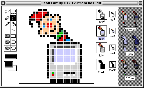
Above is a screenshot of ResEdit’s Finder icons, as shown in ResEdit’s icon editor. The icons labeled ICN# and ics# are obviously the large and small black and white icons, respectively, icl8 and ics8 are the 256 color icons, and icl4 and ics4 are the 16 color icons.
Notice that below the six icons are two image masks. The large mask is used to determine transparency for all three large icons, and likewise the small mask is used for the small icons. Since the same mask is used across all the color variations, typically all the icons of one size are just recolorations of each other, without any other significant difference.
While extracting the application icons, I noticed a few of the masks were significantly different than the raw image data, making the resulting icons not look how they were intended to. For my last post, I fixed the masks to what I think they should have been, but here I’m going to post what they actually were. Below each application name will be three images, each magnified five times. From left to right, they are the image mask, the raw image data, and the composite icon.
- Smartcom



- Components: General Ledger



- Encore

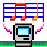
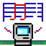
- MusicTime
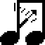


The last one is my favorite because the raw image data is also terrible.
1: Custom icons for folders were kept in an invisible file called “Icon\r” inside the folder. ^
Post a Comment